← All collectionsColor study · 10 real websites
Colorful websites worth a closer look
See how websites use color to frame a headline, separate a section or draw attention to the next action. Explore desktop screenshots with a specific detail to look for in each example.
Browse the examples ↓Curated 20 October 2026 · Editorial selection
Color that does something on the page
These examples were selected for color in the interface: backgrounds, type, controls, section transitions or illustration. Bright packaging alone was not the criterion. Some pages commit to a full palette; others keep one vivid area inside a quiet layout.
Notes refer to the screenshots in our collection, captured in October 2026. Original websites may change. Swatches are approximate visual references, not official brand color specifications.
10 colorful website examples
Open a placement for more screenshots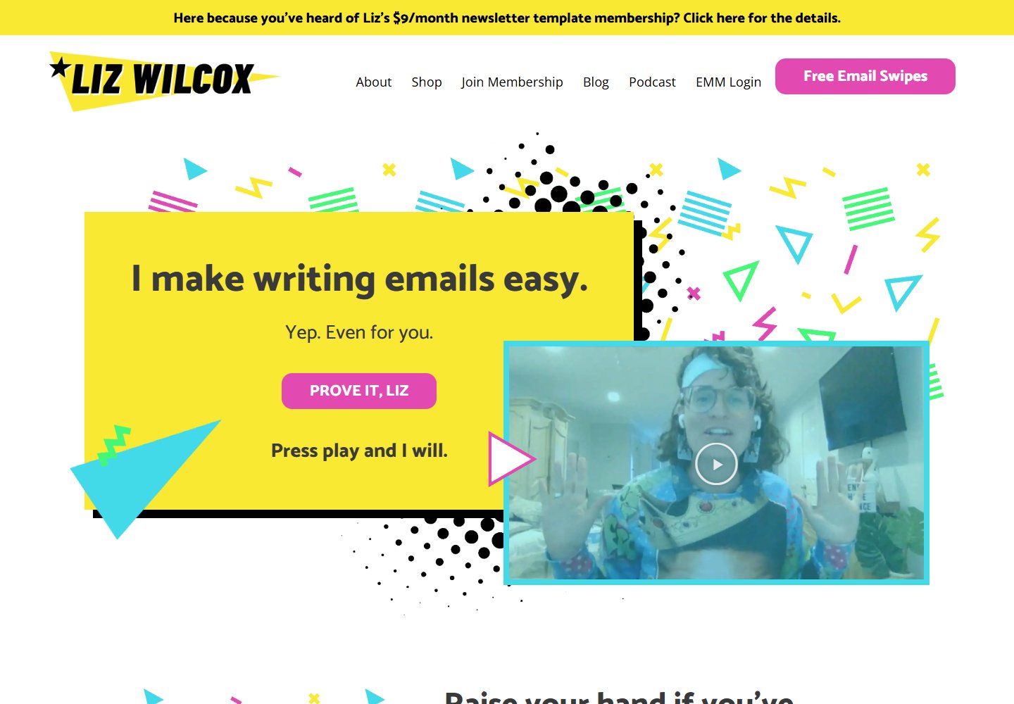
A bright panel with a clear job
A yellow headline panel takes the largest share of attention. Pink buttons and a turquoise video frame give the next actions their own colors, while white space keeps the geometric decorations apart.
View placement →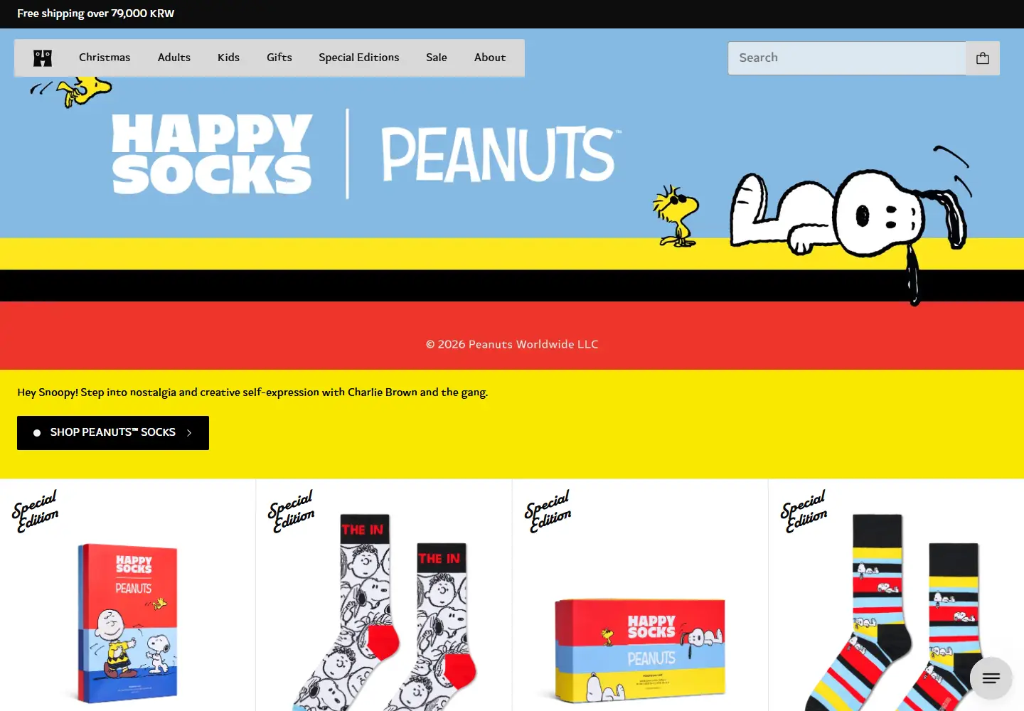
Broad bands of color
The captured Peanuts campaign moves from sky blue to yellow, black and red in broad horizontal bands. Black shopping controls stay distinct on yellow, and the white product grid gives the patterned socks a quieter setting.
View placement →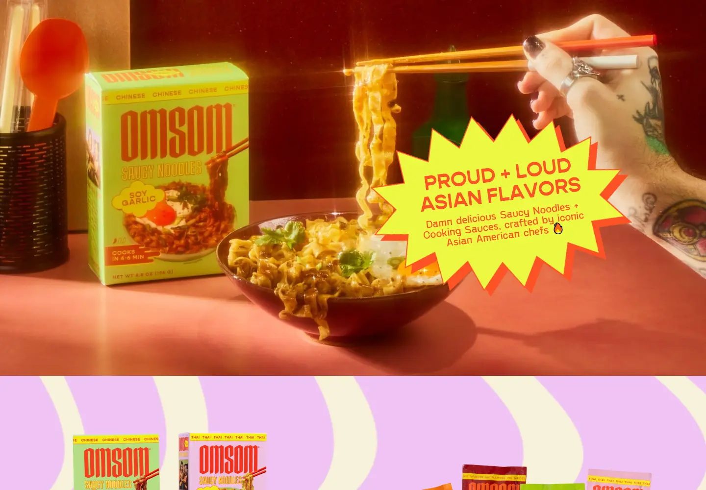
Color carries across section boundaries
A neon-yellow starburst interrupts the warm orange food scene. The next section changes to lilac and cream waves, carrying the same playful intensity into the page background instead of leaving it all on the box.
- Neon yellow
- Orange
- Lilac
- Cream
View placement →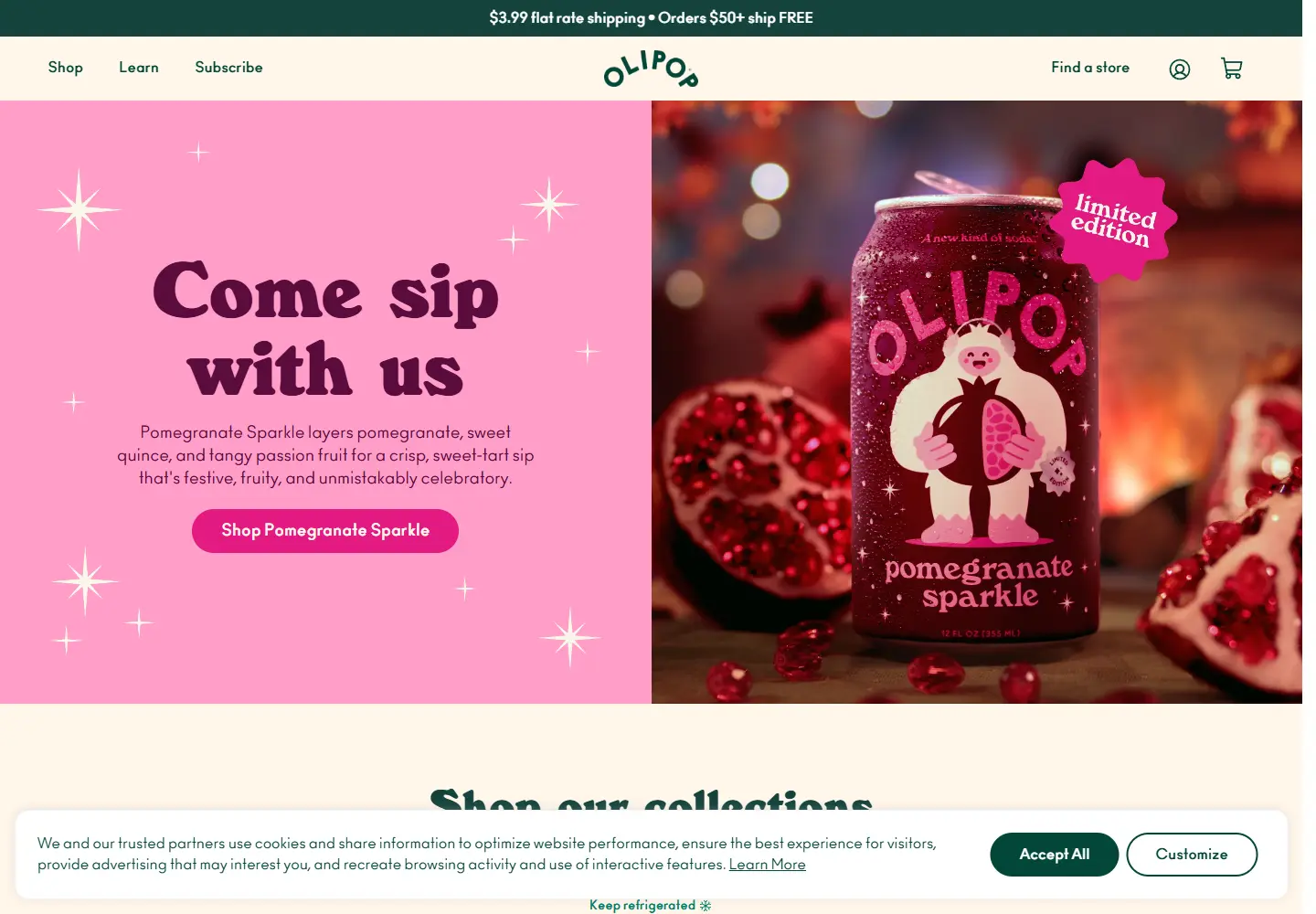
One flavor sets the opening palette
The Pomegranate Sparkle campaign pairs a flat pink text panel with a photograph of the can in the same color family. Dark plum lettering stays readable on pink, while the deep-green navigation frames the campaign.
View placement →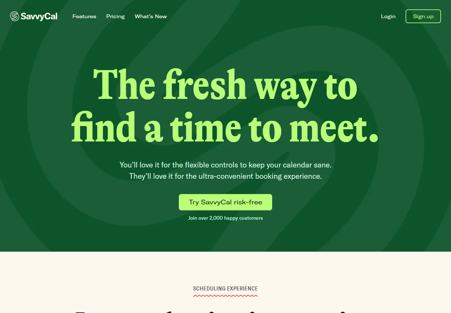
A bold palette for a software page
Bright lime typography sits on a deep-green hero rather than a conventional white software page. The call to action repeats the lime against green, keeping the headline and the signup route in the same visual language.
View placement →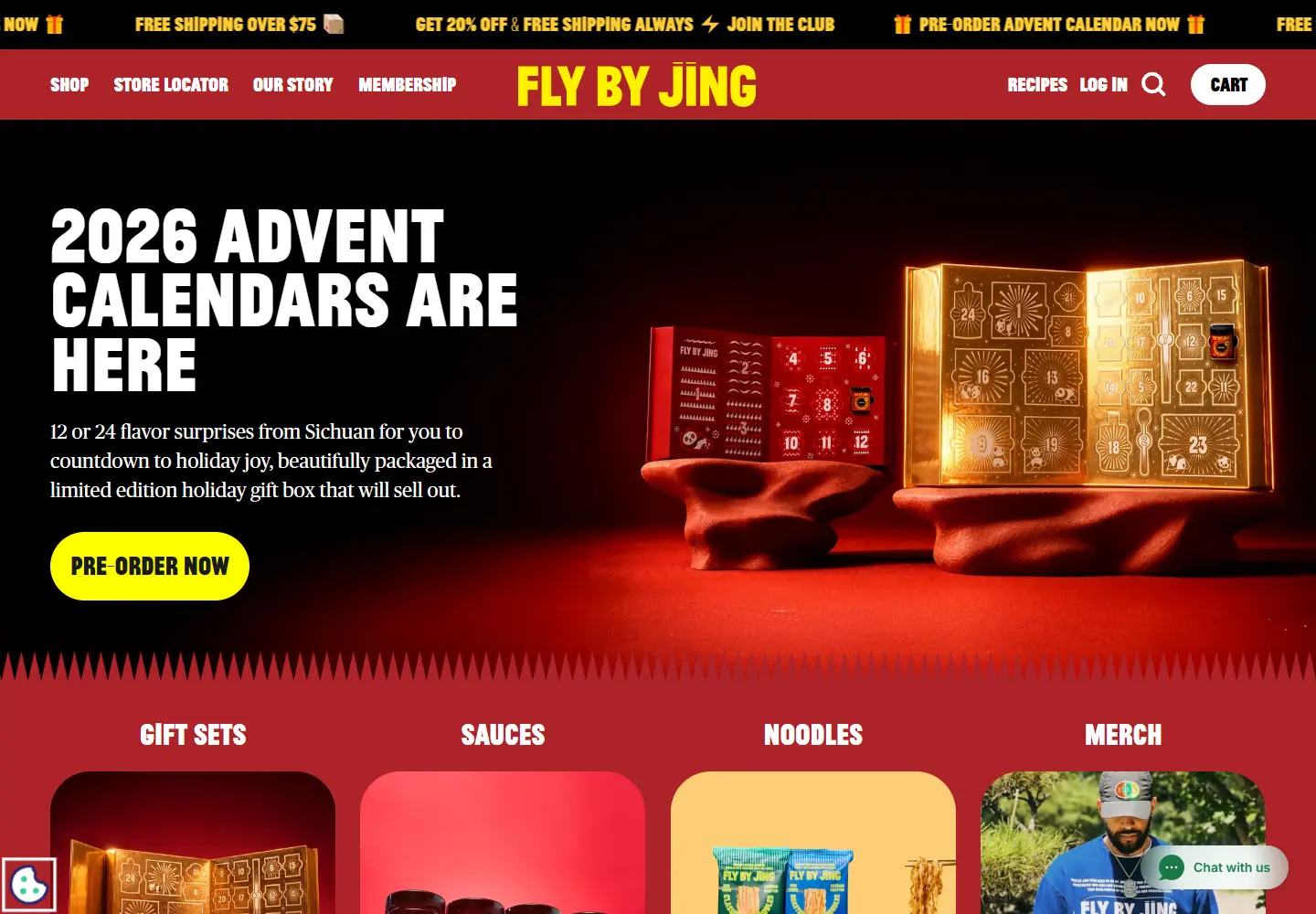
One sharp accent against a dark scene
Red navigation continues into a dark red-and-black product scene. The yellow-green preorder button creates a sharp break in that palette, and the red category strip gives the next section a clear boundary.
View placement →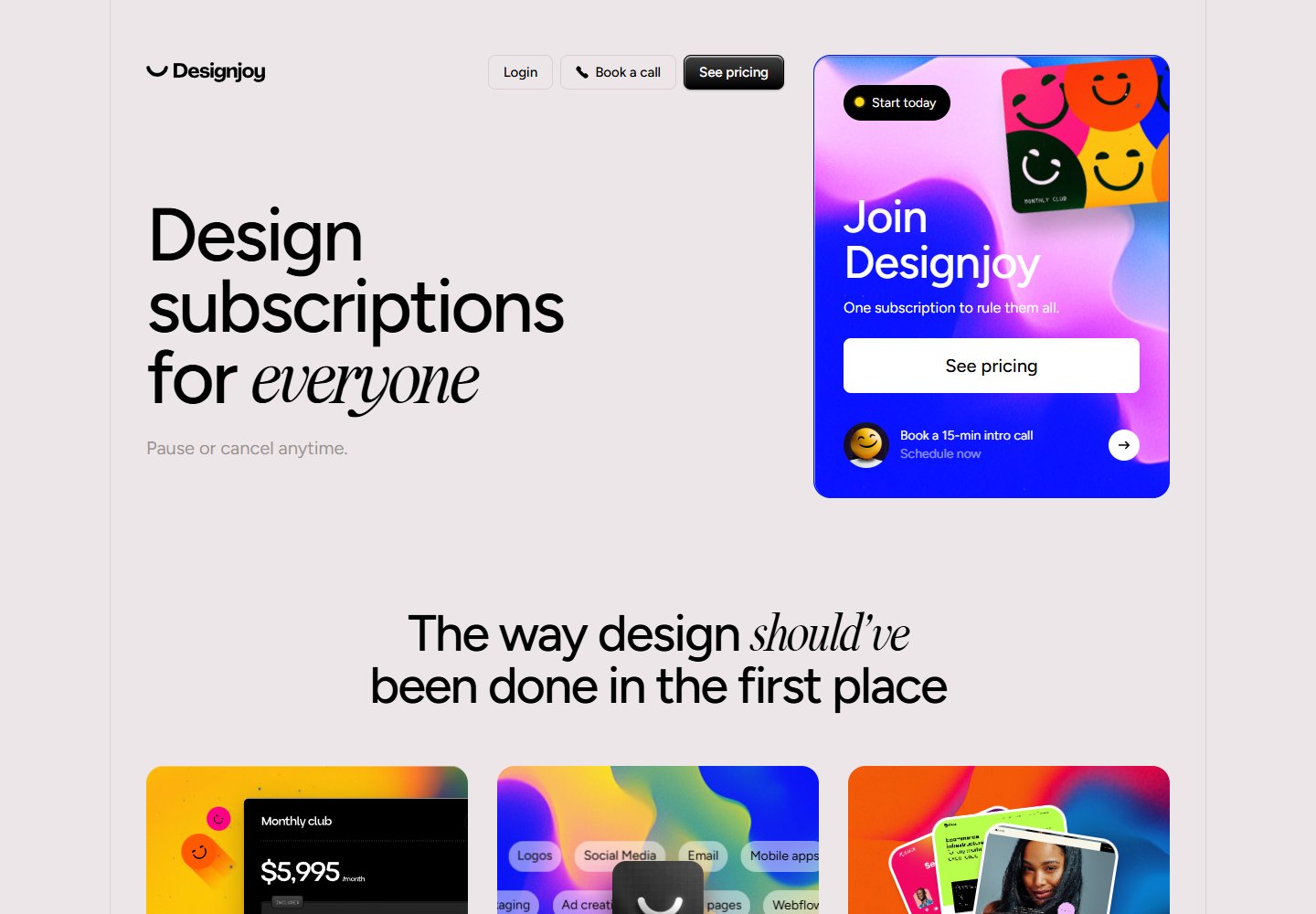
Concentrate gradients around the offer
Most of the page is pale gray with black typography. Electric blue and pink are concentrated in the membership panel, then return in the workflow cards below; the offer gets the strongest color before the supporting explanation.
- Electric blue
- Pink
- Yellow
- Pale gray
View placement →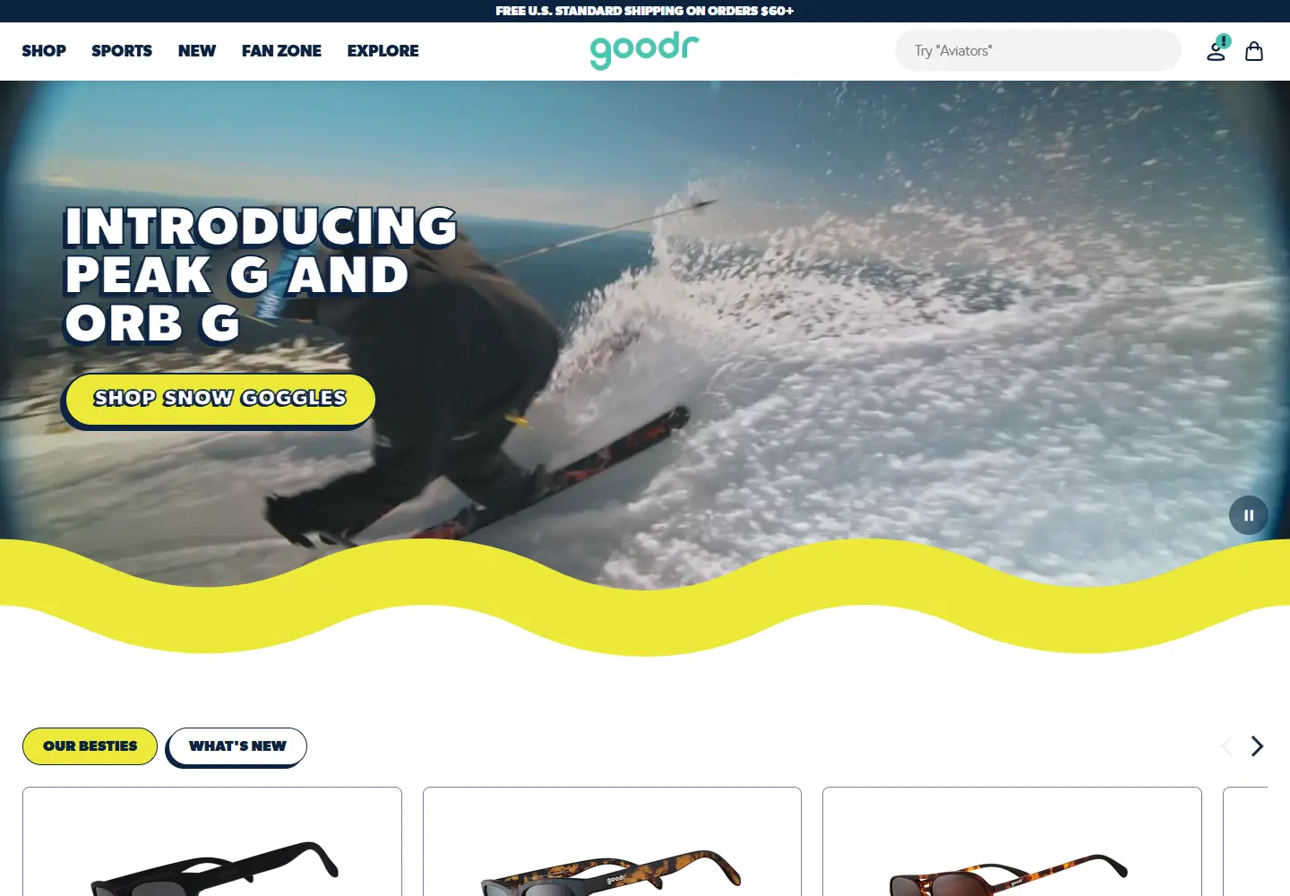
A colored edge links photograph and interface
A yellow shopping button stands apart from the cool blue campaign photograph. The same yellow becomes a wavy section edge and smaller controls below, connecting the image-led hero with the white product area.
View placement →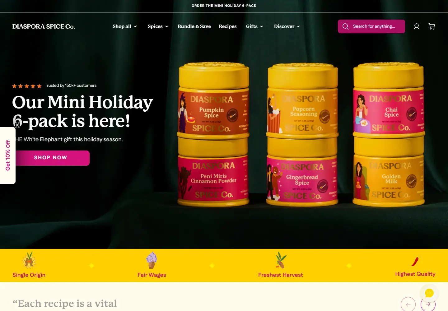
Let the interface echo the product palette
Dark green gives the yellow spice tins a strong backdrop. Magenta shopping controls and a yellow benefit strip repeat selected packaging colors in the interface, tying the photograph to the routes around it.
- Dark green
- Magenta
- Yellow
- Cream
View placement →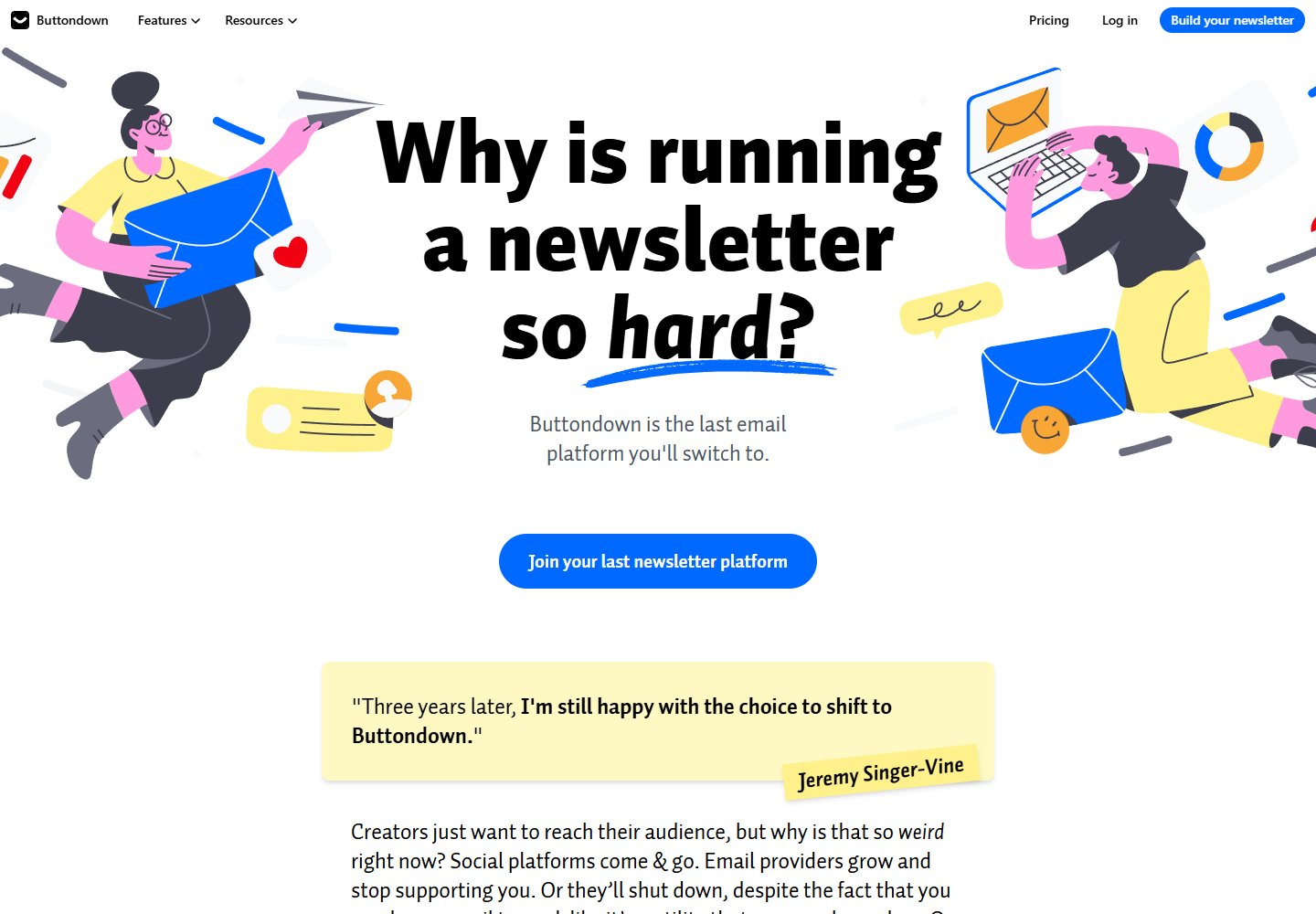
Use illustration to color a white page
Blue, pink and yellow figures frame the black headline on a mostly white page. A blue signup button and pale-yellow testimonial carry those illustration colors into functional elements without filling the entire background.
View placement →