Bokksu
An orange snack box opens into a monthly story about Japan.
Website overview
Bokksu connects a Japanese snack subscription with box photography and a story-led shopping experience.
Bokksu offers Japanese snack subscriptions. Its homepage pairs the box with tea, regional themes and stories about the people making the food.
What caught our eye
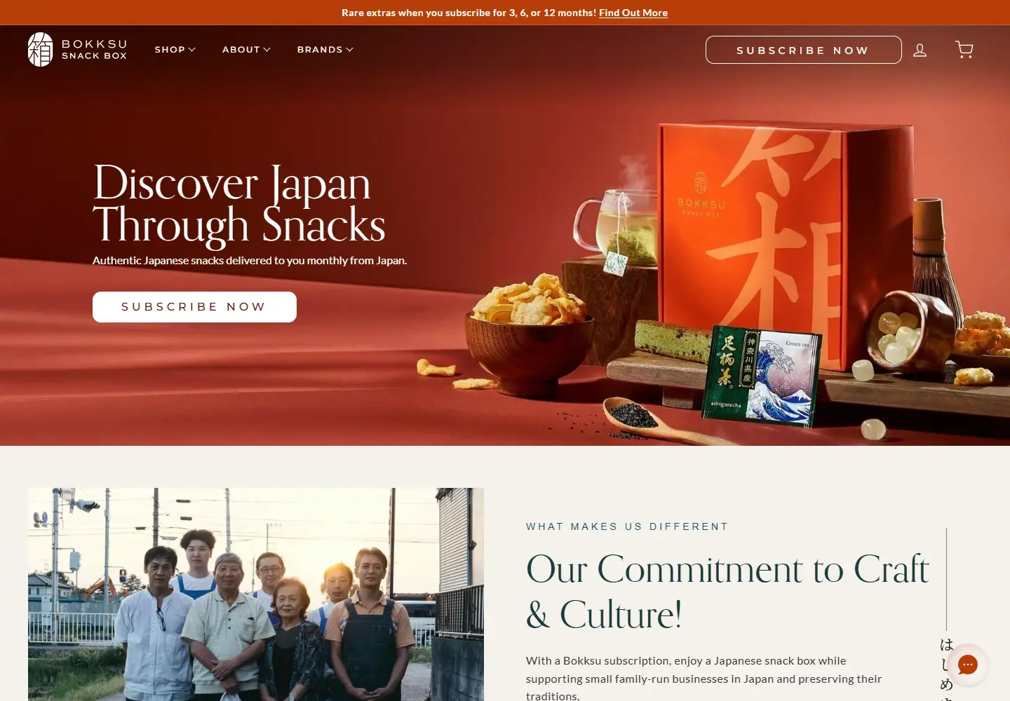
Hero: The orange box and its contents fill the right side of a red-orange background. White serif type keeps the subscription invitation separate from the busy food photography.
Product presentation: Snacks and tea appear together, so the visitor can understand the box before choosing a plan.
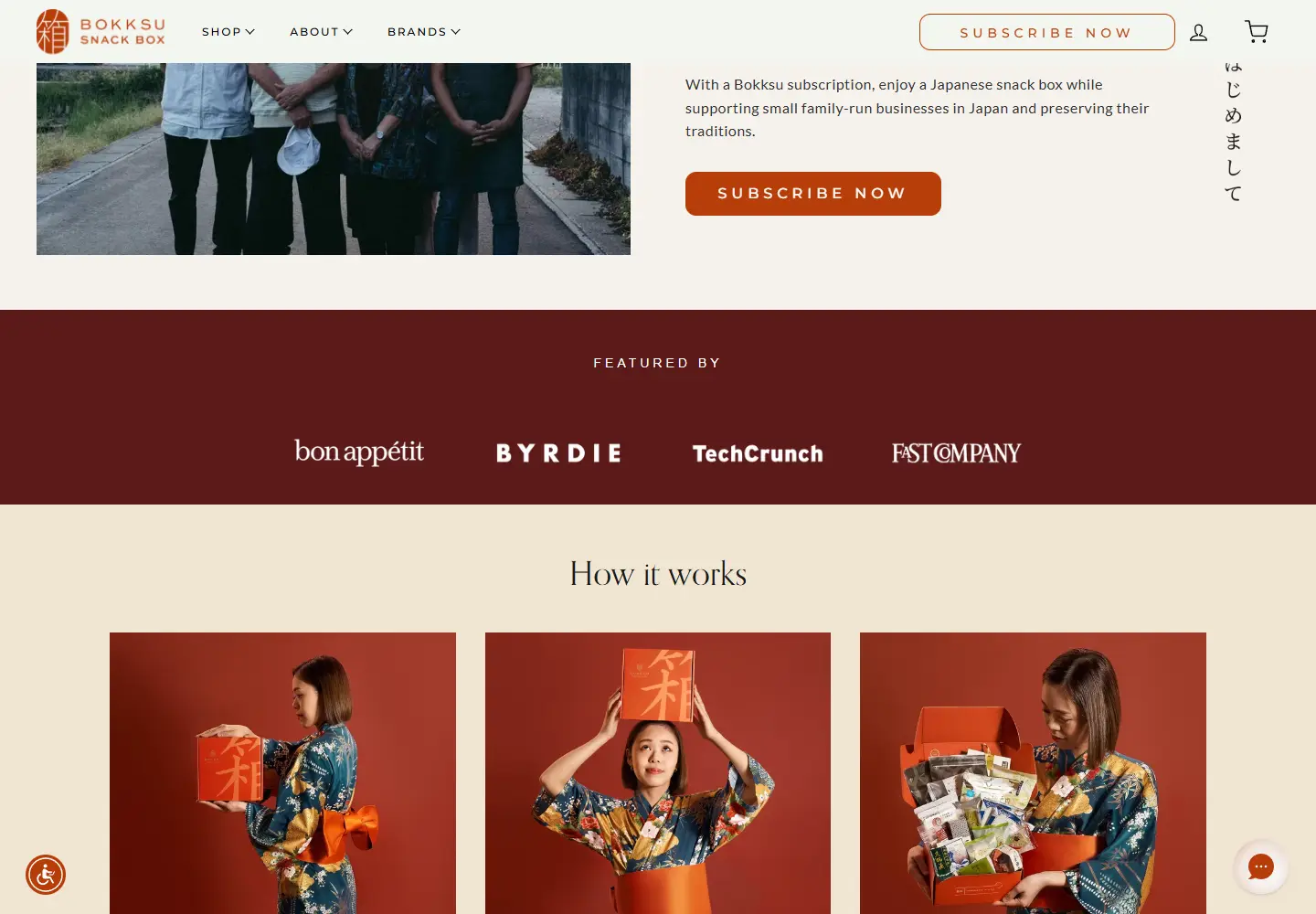
Trust strategy: A maker photograph and a row of press logos follow the hero. The page gives the product a human source as well as a media context.
Layout: A cream three-step section breaks the subscription into small visual steps. It provides a quieter explanation after the opening color block.
Who might find it useful?
Designers studying subscription products, food photography and gift-shopping journeys.
Website screenshots