East Fork
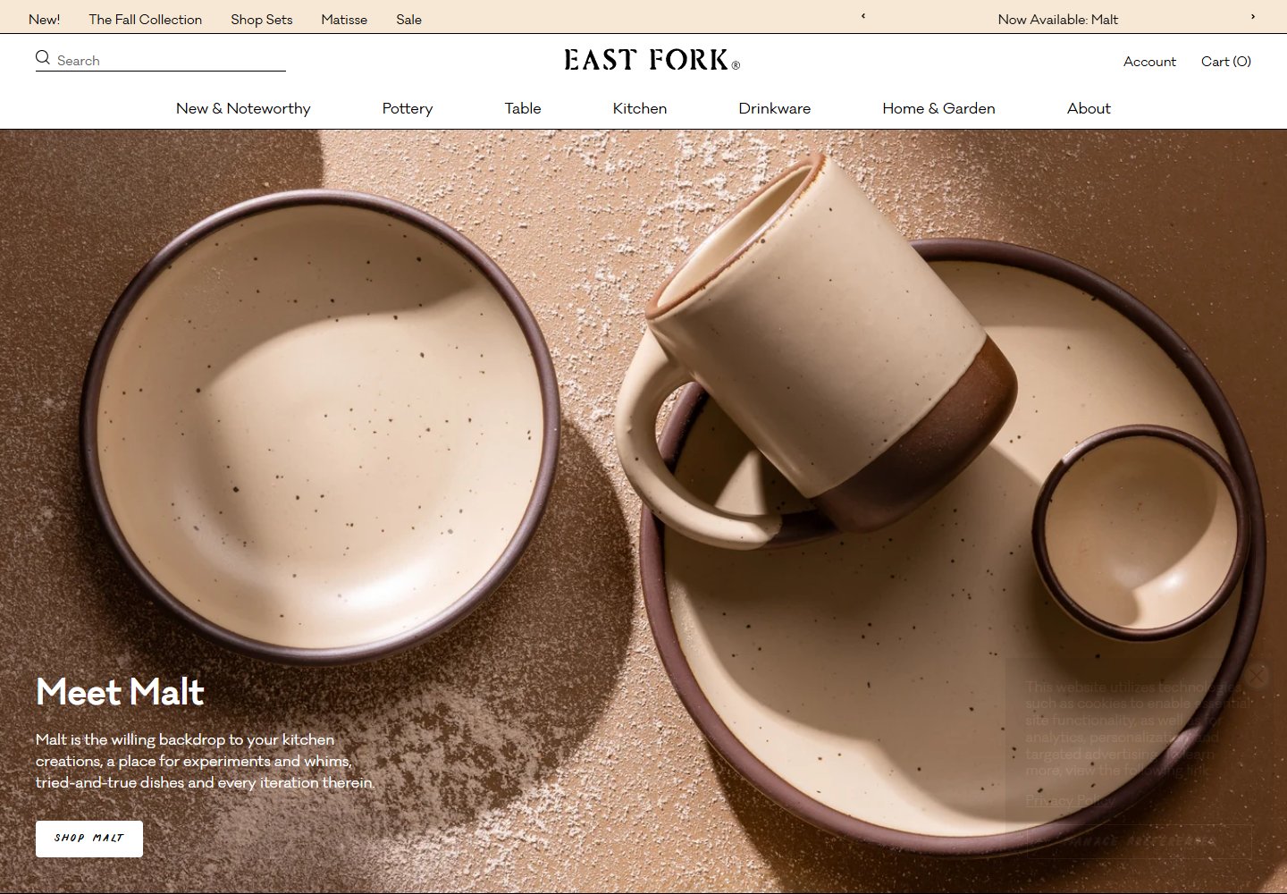
Oversized pottery photography turns glaze and texture into the homepage hero.
Website overview
East Fork pottery becomes the focal point of the homepage through close attention to glaze, scale and surface texture.
East Fork sells pottery and home goods. This desktop sample follows its seasonal color launch from a full-width pottery photograph into product cards and collection links.
What caught our eye
Hero & headline: A close crop of bowls and a mug fills the opening screen. A short color-launch headline and white shopping button sit at the lower left, leaving most of the space to the ceramic surfaces.
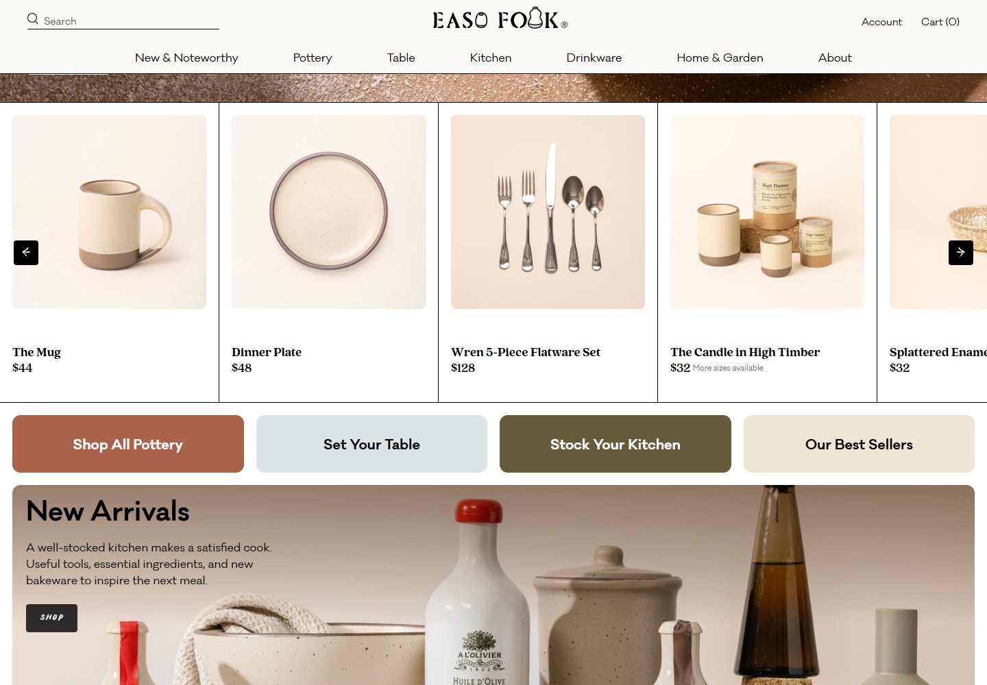
Color & layout: Cream and brown tones in the hero carry into softly lit product photographs. Thin black dividers organize the catalogue, while muted terracotta, blue and olive mark the collection links.
Product presentation: Individual items follow the hero with names and prices beneath large photographs. A separate palette section offers another way to explore the range by glaze color.
Trust strategy: A company-story section introduces the potters and their Asheville base. Journal entries about recipes, color choices and firing processes give visitors a route into the people and work behind the products.
Who might find it useful?
Designers studying material-led photography, seasonal collection heroes and color-based product browsing.
Website screenshots