Kagi
A search box opens the story before the feature explanations.
Website overview
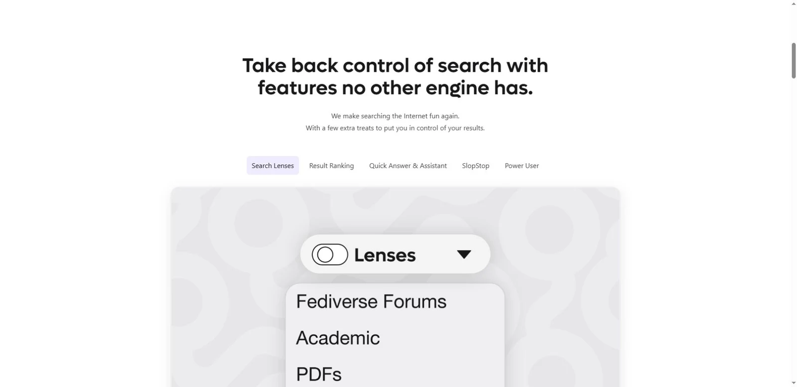
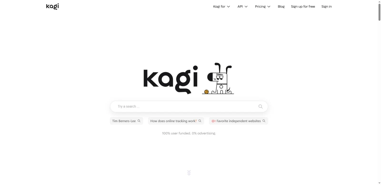
Kagi opens with its logo, mascot and a prominent search field. Example queries make the intended interaction visible, while a short funding message introduces the subscription model. Further sections explain controls and comparisons. Study how a familiar interface creates the first impression before the page develops its product argument.
What caught our eye
Hero & interaction: The logo, mascot and a wide search field occupy the first screen. Suggested queries make the intended action visible before the feature sections begin.
Color & layout: The opening uses generous white space, then illustrated feature explanations and comparison sections provide more detail.
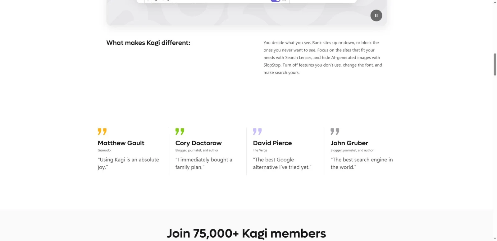
Trust strategy: Testimonials and a funding message explain the product's positioning. Subscriber figures and comparisons are statements on the vendor's site, not independently measured results. No paid account or search-performance test was used for this website overview.
Who might find it useful?
Product designers and SaaS founders exploring product-led heroes and subscription messaging.
Website screenshots