Vacation
A sunscreen storefront that builds a whole leisure world.
Website overview
Vacation sells sunscreen and fragrance through a leisure-themed storefront. Its packaging, poolside imagery and promotional language give everyday products a shared setting. The homepage places customer-review cues near a shopping invitation, then expands into product collections and editorial scenes. Study how the same brand voice reaches the offer, product names and supporting content.
What caught our eye
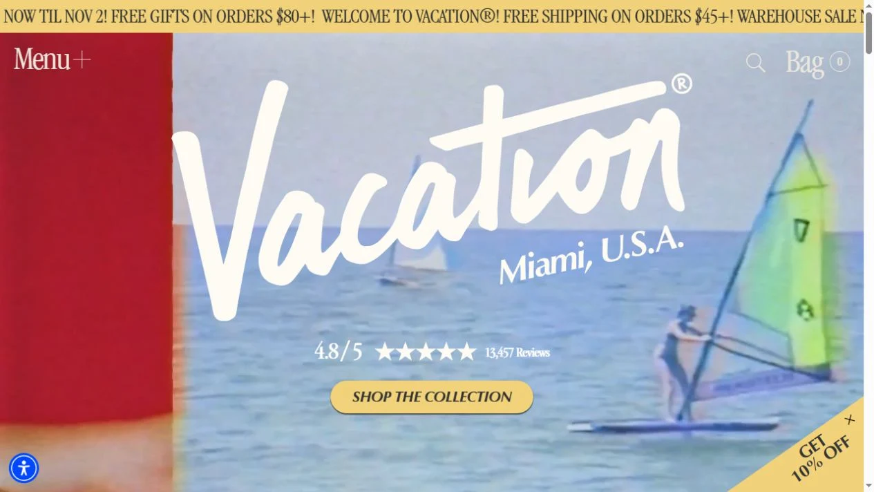
Hero & headline: The oversized Vacation wordmark sits over poolside footage. A yellow shopping button and review cue give the image a clear commercial next step. This capture is a still image of the homepage, not a playable video.
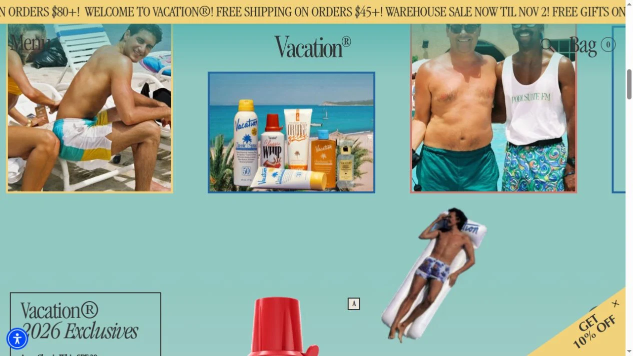
Color & layout: Pale yellow, turquoise and cream continue through promotional strips and product scenes. The serif copy and picture captions reinforce the leisure setting.
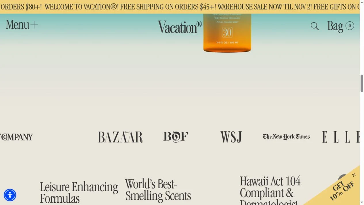
Trust & product presentation: Review counts and press marks appear in the page. They are presented by the brand; the notes here examine their placement rather than independently validating them.
Who might find it useful?
Brand designers, ecommerce founders and creatives studying a consistent visual world.
Website screenshots